
The client
inEDU (Asociația „Inițiativă în Educație”) is a Timișoara NGO that runs programmes for teachers and students: an international conference on teaching with space science, a month-long festival of science and culture, meetings between children and writers, and teacher training held in museums and built around local heritage.
They ran a lot of events in 2023, the year Timișoara was European Capital of Culture, and kept going through 2024. We designed the identity for most of them, along with nearly everything those identities were printed or posted on, from posters and roll-ups to badges, certificates, stickers and a photobooth frame. This post is about how that work came together, including the parts that rarely make it into a portfolio.
Starting with the key visual
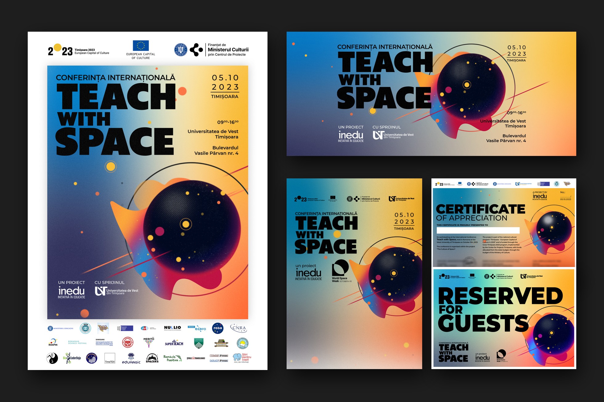
Teach with Space took place on 5 October 2023 at the West University of Timișoara, during World Space Week. It was a conference for teachers, so the poster had to look serious enough for a university hall and still be something a teacher would pin up in the staff room.
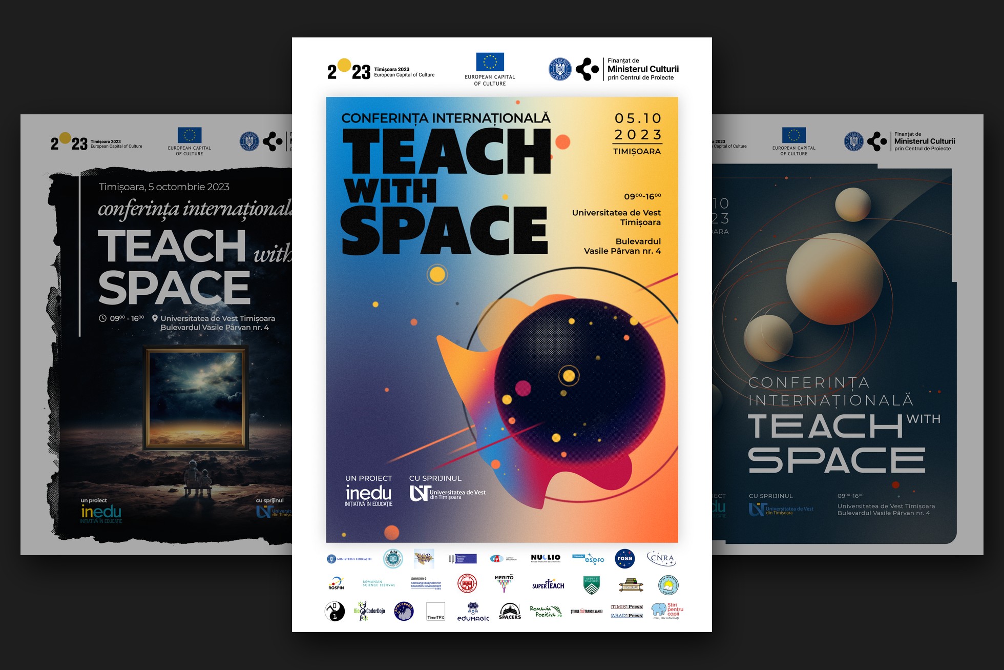
We tried three directions. The first had pale spheres in slow orbit on a deep blue ground, calm and scientific. The second was dark and painterly: a gilded frame standing on a moonlit plain, opening onto a stormy sky. We went with the loudest one, a dark planet in a grainy orange-to-blue gradient with a few bright satellites and heavy stacked type you can read from the back of a room. It still works shrunk to a social media avatar, and it holds up on a two-metre roll-up.
Second lives for the other directions
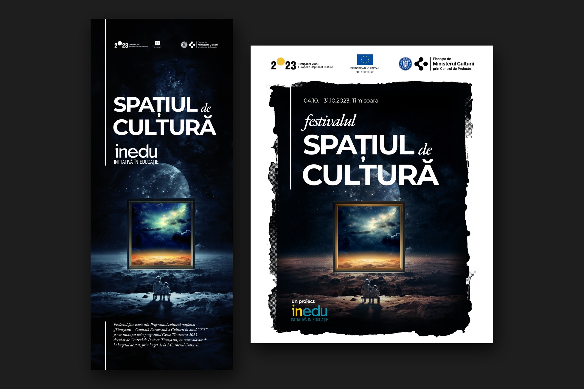
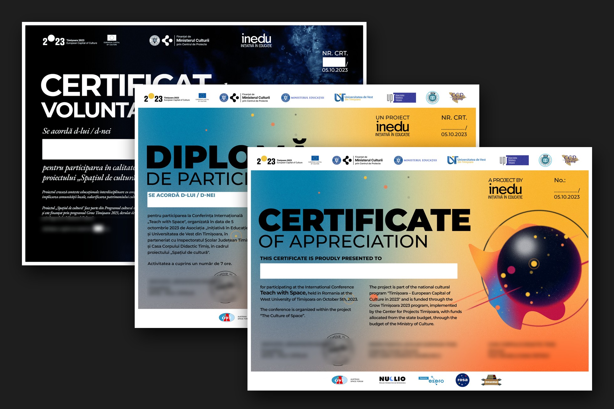
Teach with Space opened Festivalul Spațiul de Cultură, a month of events from 4 to 30 October, and the festival needed its own look that still sat close to the conference. The painterly space scape became the festival's key visual: two small figures on a bench, a gilded frame, a sky glowing at the horizon. It works best tall, so we set it on the roll-up first and then carried it onto the dark volunteer badges and certificates. The pale orbiting spheres went to the festival posters that had to carry the most partner logos.
Everyone sees the poster, and in a way it's the easy part. The rest of the job is less visible. A conference needs badges for guests, organisers, volunteers and photographers; certificates of participation; diplomas for speakers and facilitators; volunteer certificates; and an English certificate of appreciation for the international guests. Then there's the booklet, the reserved-seat cards, slates to run before partner videos in 16:9 and 4:3, social media covers, stickers, and a photobooth frame for the coffee break.
Nobody photographs these for a portfolio. They are also what people take home: the badge on its lanyard, the certificate that ends up in a drawer, the photo from the booth.
We designed them alongside the posters, with the same planet, gradient and type down to the smallest badge, and built each piece as a template.
The guest and organiser badges were set up in InDesign with data merge, so a spreadsheet of names became a print-ready run of badges in one pass. Certificates kept a white field for the name and fixed places for the number and signatures, so they could be filled in without anyone nudging the layout. Every print file also got a corrected CMYK version after proofing, because a gradient that glows on screen can go muddy on paper.
The badge on the lanyard is the piece of the identity people take home.
Designing for the logo wall
A cultural project in a European Capital of Culture year has a long list of people to credit: funders, the programme, the ministry, the university, the school inspectorate, the teacher training centre, partners and media sponsors. They all need to be legible, and some posters carried more than forty logos.
We gave the logos a fixed band at the foot of every poster, on white, in a steady grid, and set the funders' block at the top the same way every time. With that settled first, the artwork above could be as loud as it wanted. It's unglamorous work, and a large part of why the posters don't look crowded.
One author, several audiences
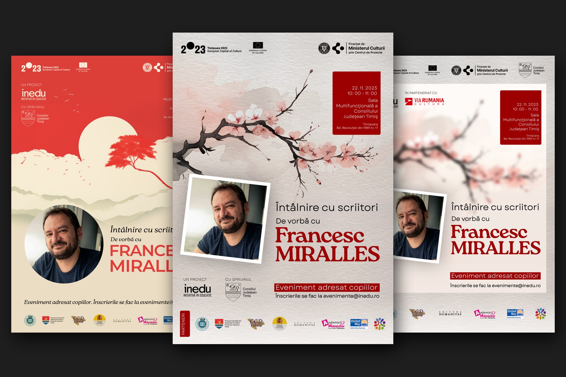
In November 2023 inEDU brought the Spanish writer Francesc Miralles to Timișoara for his first meetings with readers here: talks for children, and an evening dialogue for adults about Japanese secrets for a long and happy life. Each event needed its own poster, and together they still had to read as a series.
We borrowed from Japanese ink painting. The children's events got cherry blossom on warm paper and a low red sun over a lone tree; the evening dialogue got red maple leaves over misty mountains and a quiet classical serif. A red accent and a framed portrait of the author run through all of them.
From space to school
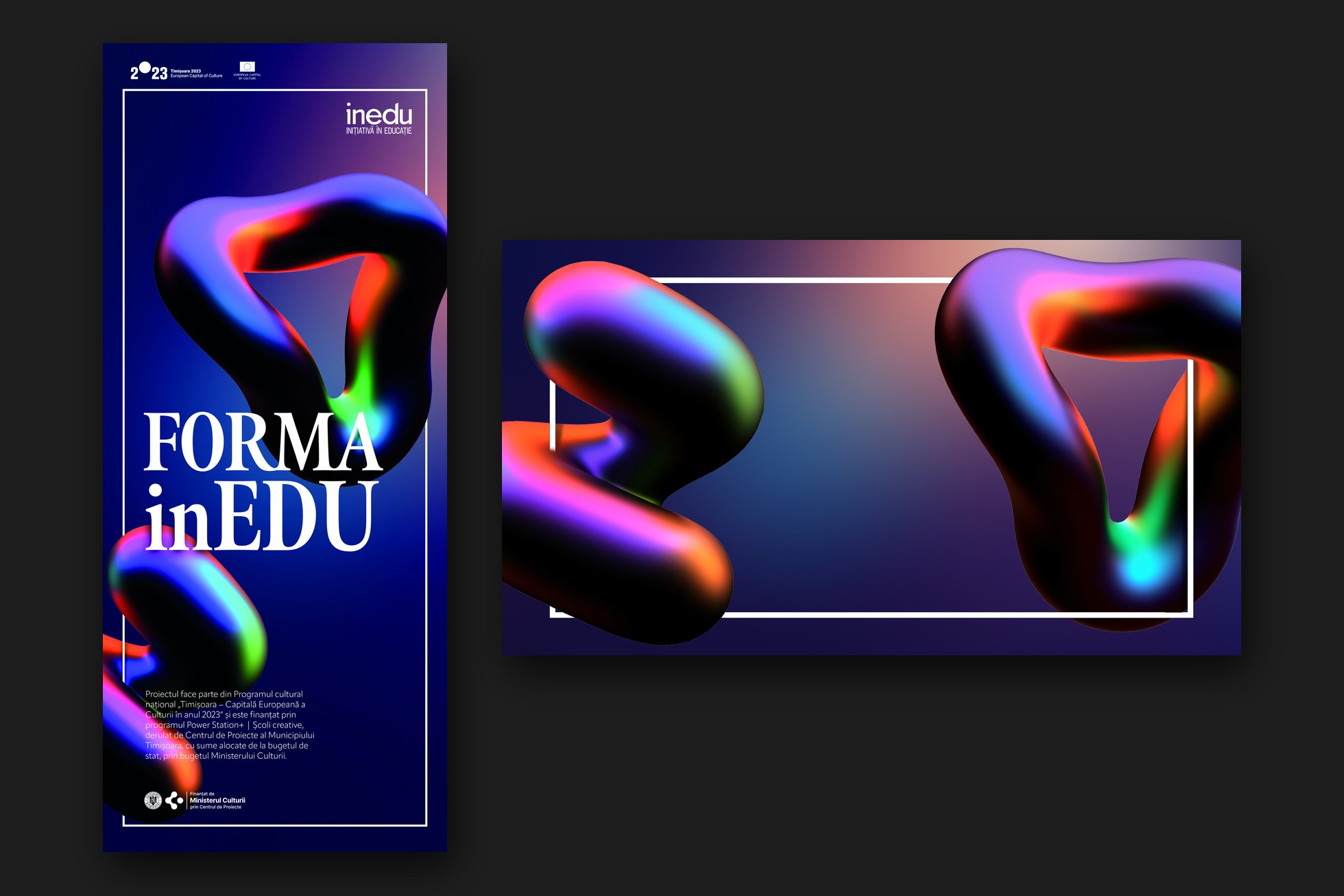
In 2024 the work moved from the planetarium to the classroom. FORMA inEDU ran from February to June and helped teachers bring art and cultural resources into school. Its identity uses glossy, iridescent 3D forms twisting around a classic serif wordmark on a deep indigo field. We kept the forms abstract because the programme covered museums, heritage, art and history, and a literal image would have picked one of them over the rest.
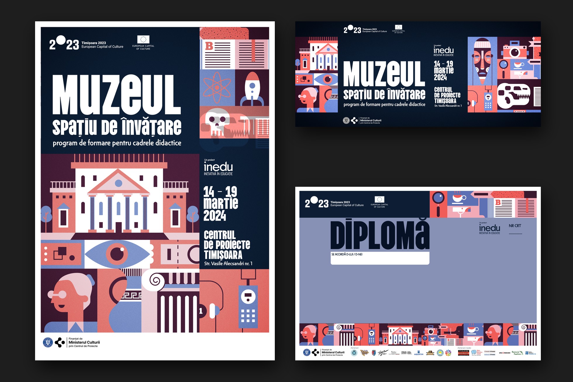
Each event inside the programme got its own look. Muzeul – spațiu de învățare, a course for teachers held from 14 to 19 March 2024, is set in a flat, illustrated world of navy, coral and lilac, with a museum façade, a watchful eye, a fossil skull, a rocket, a mask and an audio guide. The illustration is cut into tiles, and the tiles rearrange to fit a portrait poster, a wide cover, a badge or the border of a diploma.
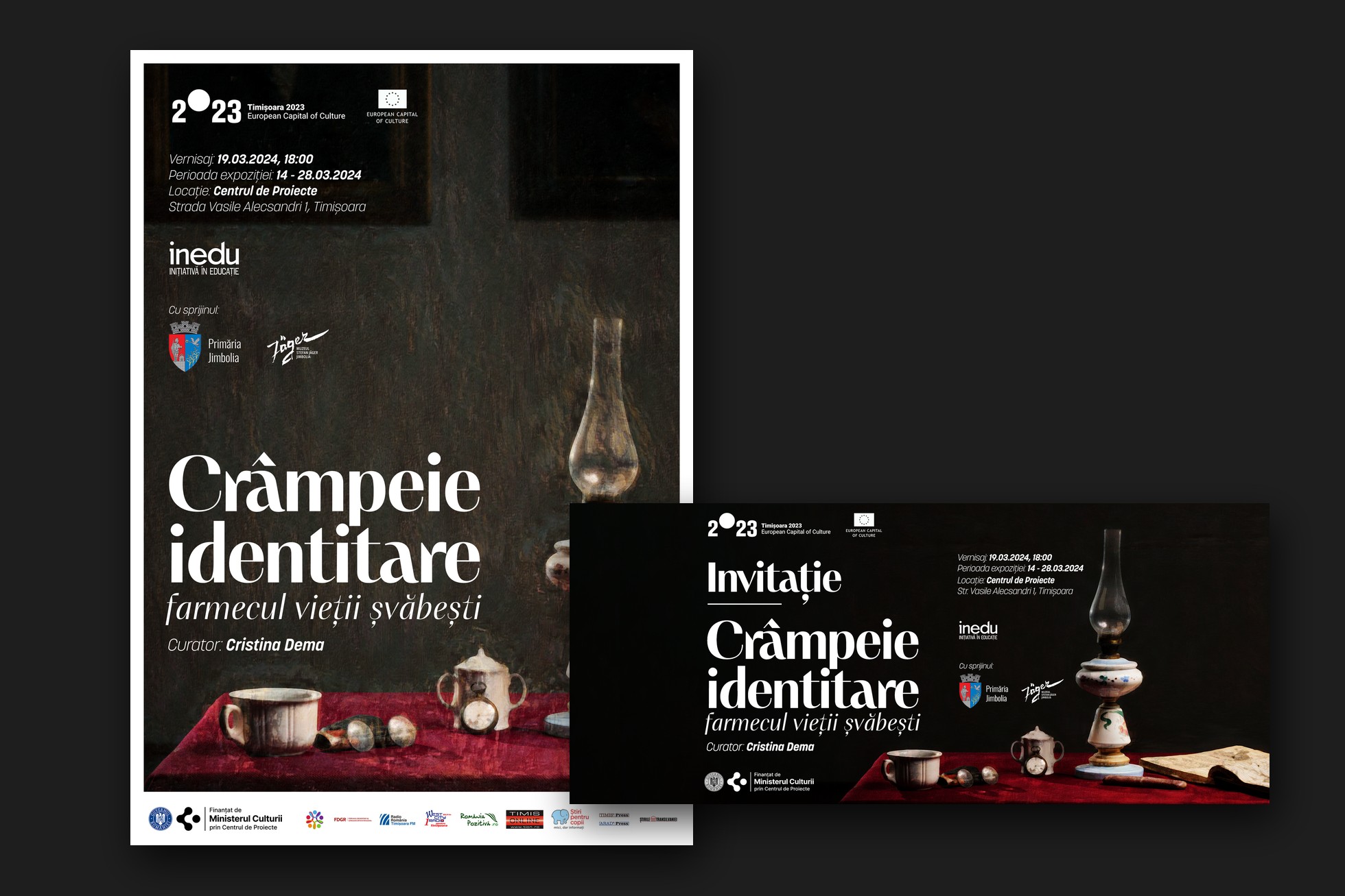
Crâmpeie identitare – farmecul vieții șvăbești, an exhibition about Swabian life in the Banat, ran from 14 to 28 March 2024 in the same building. It is built on a single photograph: an oil lamp, porcelain and a pocket watch on red velvet, lit like an old painting, set with an elegant serif and a lot of dark space around it. Running in the same weeks and the same venue as the museum course, it needed to look nothing like it.
Working with inEDU
inEDU made the work easier. They knew what each event was for and who it had to reach, and could say it in a sentence. They let us explore several directions and took each one seriously before choosing.
The practical side went smoothly too. Partner lists and logos arrived organised and in the right versions, and feedback came in one clear, consolidated round. Most deadlines left enough time for details like certificate kerning, badge spacing, or a second proof when a colour looked off. When a deadline was tight before an opening, the team was good company for the sprint.
Two years of this taught us mostly about sequence. Design a badge or a certificate early, because the smallest piece shows fastest whether an identity works. Fix the logo band before the artwork. Build templates the client's team can fill in, and data-merge anything that carries a name.
Keep the directions you don't pick, too. On this project the ideas that lost the first round became the key visuals of other events. For an NGO running many events a year, that reuse is how a small team ends up with work that holds together as one body.